December 9, 2023
New blog page
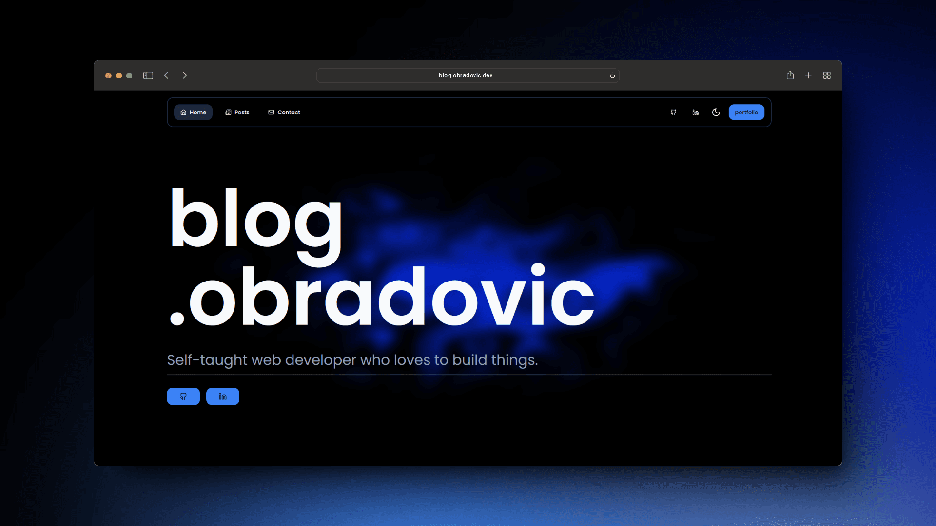
Showcase of the new blog page

This blog was one of the first projects I've ever made. It was a simple blog page with a few posts, section with some pictures I took with my friend and an about me section. It has been a year since, and I've learned a lot, gained a lot of experience working as a web developer and decided to create a new one.
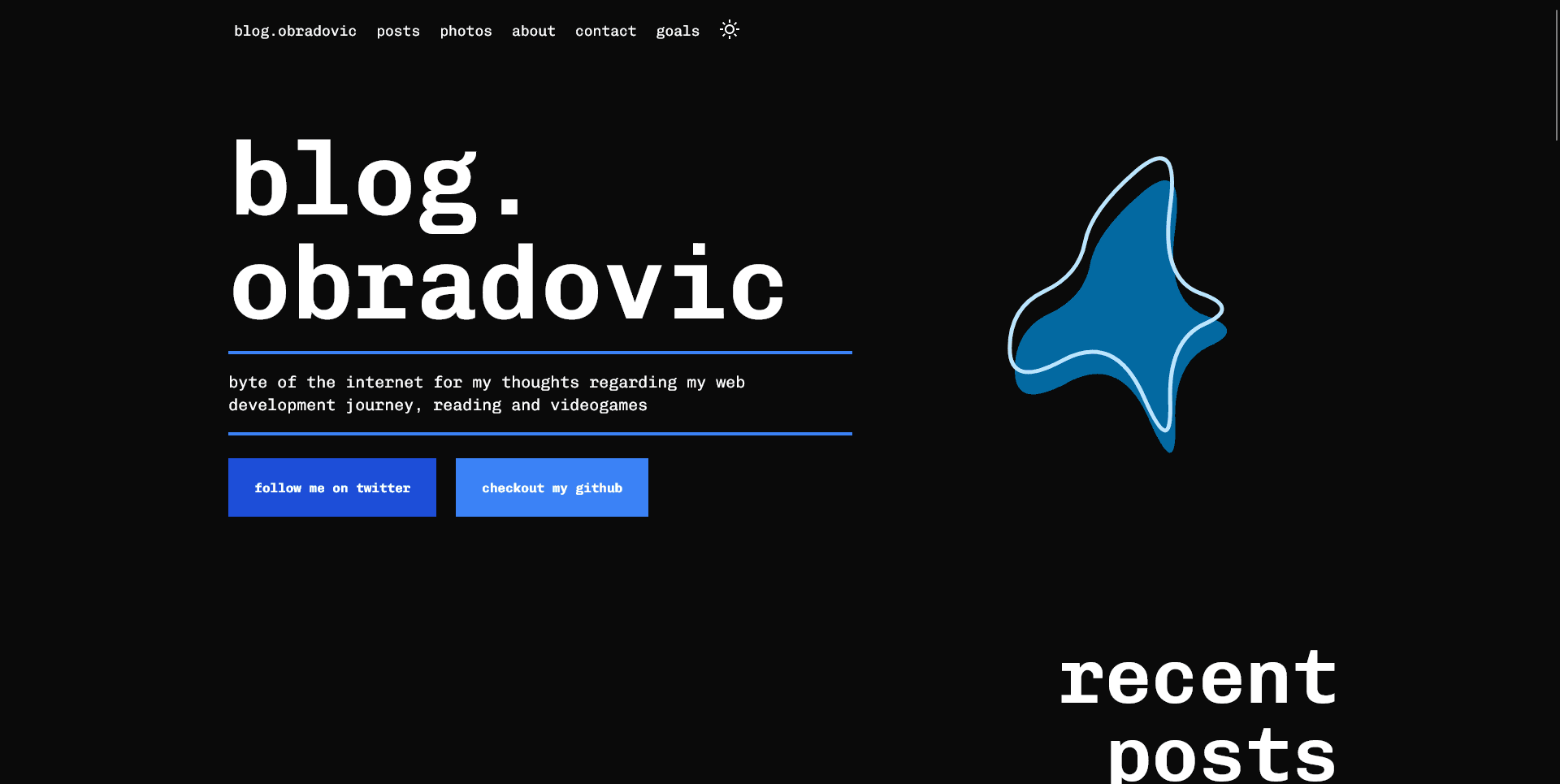
The old blog

Look at the old blog page, to see how it looked like click here.
The old blog was a simple React app with GraphCMS used as a headless CMS. When I look back it was a project I have put a lot of time into and learned a lot from. From countless iterations and going back and forth with myself over what the design should look like, to learning how to use GraphCMS and how to fetch data from it.
It was the first project I created after starting my work as a web developer and I was really proud of it. But as time went on I started to notice some flaws in the design and performance of the page. I wanted to create a new blog page that would be more performant, easier to maintain and would have a better design that would be more in line with my current design style.
The new blog
The new blog is a definite improvement over the old one. From the design to the performance, everything is better. I've decided to use Next.js as a framework for this project, as I have been using it for a while now and I really like it. For the simplicity sake I've decided to drop GraphCMS and use Markdown files in the shape of MDX coupled with contentlayer for the blog posts.
Design of the whole page is based on the design of my new portfolio page as they come under the same umbrella and are supposed to be a part of the same website. The only thing that is different is the color scheme or should I say the primary color with green being the color of portfolio and blue for blog.
For styling and animations I've used TailwindCSS and Framer Motion. I've used TailwindCSS for a while now and I really like it. It's a great tool for creating simple and responsive designs. Framer Motion is a great tool for creating animations and I've used it for the animations on the portfolio and here. I've also used shadcn's UI component library to make everything pop a bit more.
List of all the technologies used
Conclusion
I'm really happy with how the new blog page turned out. It's a definite improvement over the old one and I'm really proud of it. I've learned a lot while working on it and I'm looking forward to working on new projects and learning new things.
December 9, 2023
Other posts
A list of my other posts

